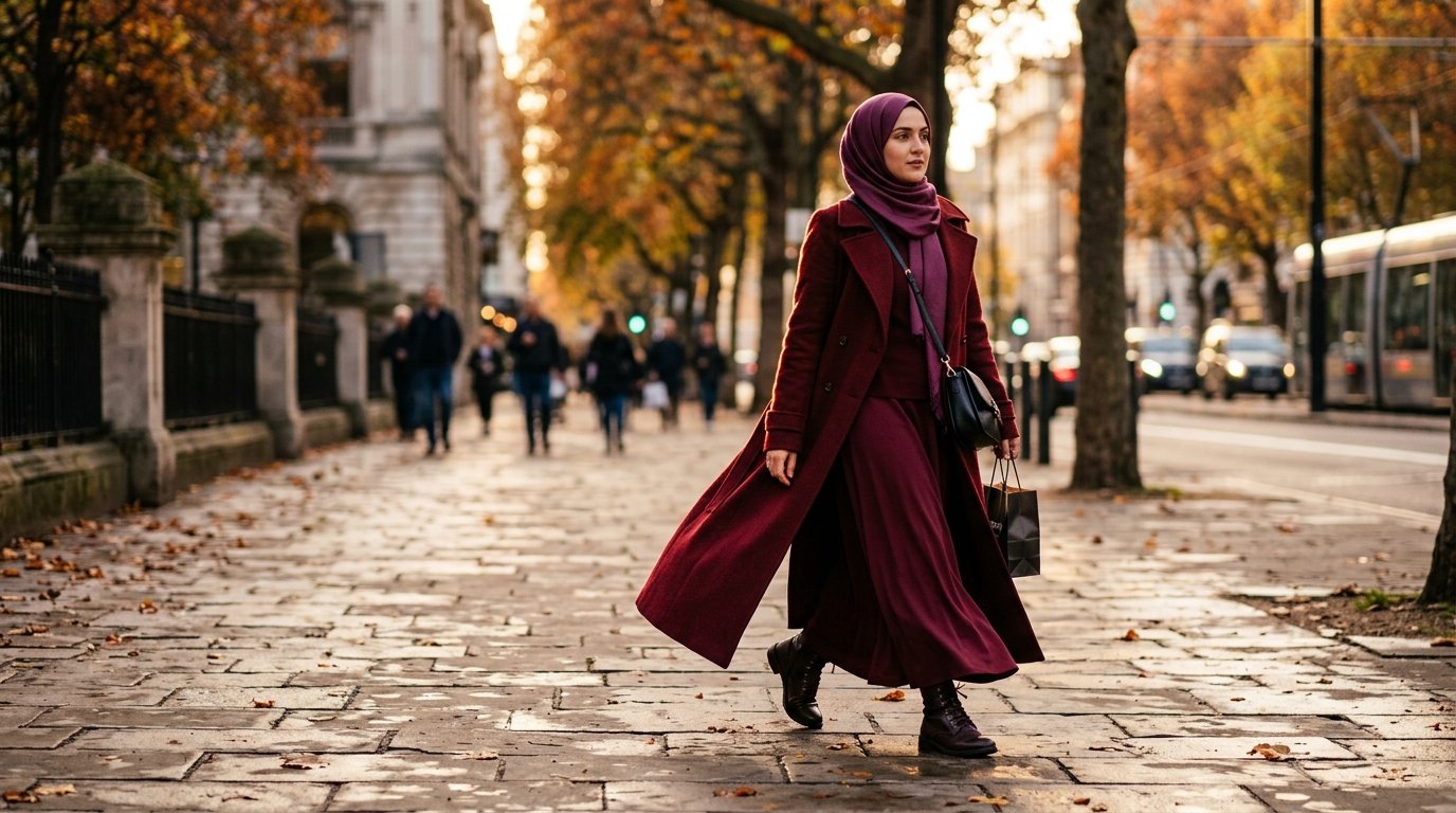
Fall 2026’s Colors Were Styled for Bare Necklines and Short Hems — Here’s the Dosage Rule for the Rest of Us
Read six fall colour guides this week and you will find the same instruction underneath every shade: use it as a pop. An accent bag. A single knit against neutrals. Let the colour be the statement and let everything else stay quiet.
That advice is correct — for an outfit that shows a neckline, a forearm and a calf. On a maxi hem with sleeves and a scarf, the exact same “pop” covers somewhere between two and three times as much surface. The colour that was meant to be a full stop becomes the whole sentence.
So this is not another list of the season’s shades. It is the dosage.
Quick answer: how do you wear fall 2026’s color trends modestly?
Downgrade every trend colour by one garment size. What editors style as a coat, wear as a skirt or scarf. Keep saturated shades to one of your three visible blocks — scarf, top layer, bottom — and let the other two anchor in chocolate brown, cream or texture-mixed black.
The season’s palette, briefly
Pantone published its colour report for the Fall 2026 New York shows back in February, and the through-line across the season’s coverage has been consistent since: grounded earth tones sitting beside genuinely loud accents rather than replacing them.
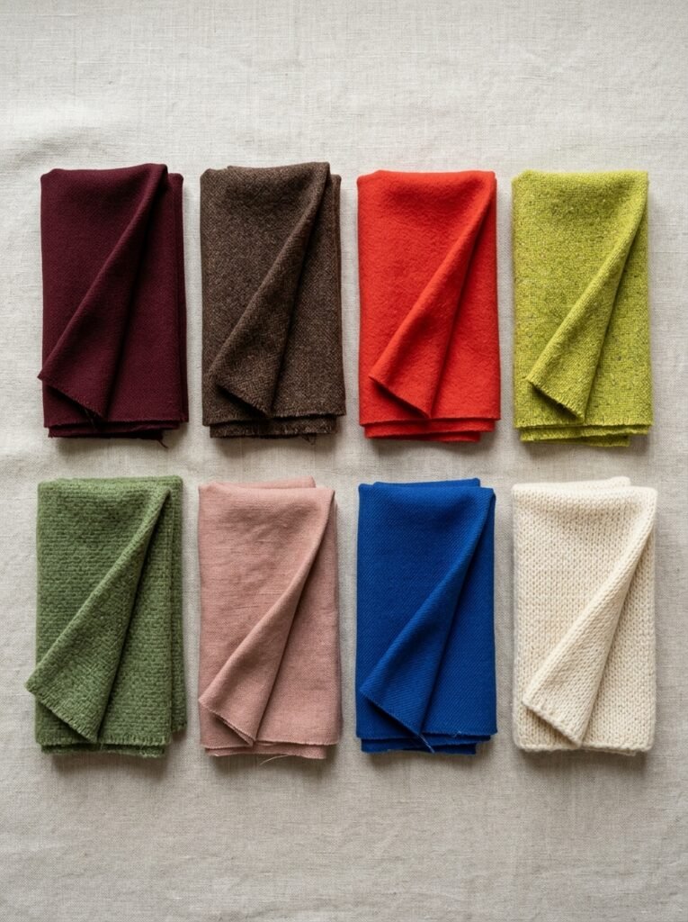
The shades doing the most work this autumn:
- Oxblood and burgundy — the season’s anchor red, deep and wine-toned
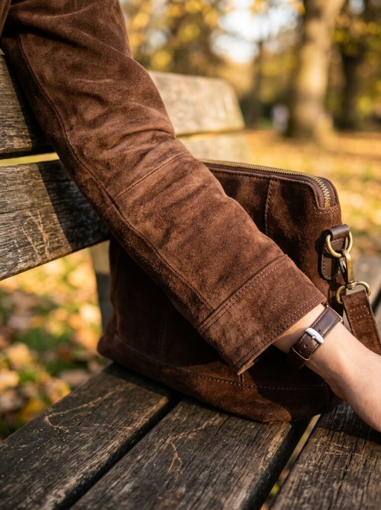
- Chocolate brown — widely treated as the new black, and stylists have singled out dark brown suede in particular as the texture of the season
- Tomato red and cherry red — carried straight over from spring, warmer and more orange-leaning than a classic red
- Chartreuse — the yellow-green power play, showing up as the counterpoint to all the deep tones
- Moss green and burnt olive — earthy enough to behave like neutrals
- Muted clay and blush pink — dusty pinks and berry tones easing into the autumn palette
- Cobalt — the statement blue that refused to leave after two seasons
- Warm cream and texture-mixed black — the anchors, with black specifically working this season through mixed surfaces rather than flat single-fabric looks
Every one of those is wearable covered. Not every one is wearable covered in the dose the guides suggest.
The surface-area rule
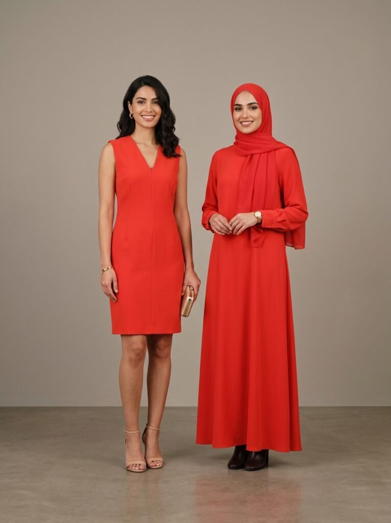
Here is the maths nobody writes down.
A standard styled outfit in a trend guide shows roughly three colour zones: a top, a bottom, and skin breaking them up at the neck, arms and legs. That skin does structural work. It separates blocks, it stops two colours from touching, and it dilutes anything loud.
A covered outfit removes almost all of it. What you have instead is fabric meeting fabric — scarf against top layer, top layer against skirt or trousers. Three colour blocks, no dilution, and each block is physically larger.
The rule: take whatever garment the trend guide recommends, and move one size down.
- The guide says chartreuse coat → you wear a chartreuse scarf or knit
- The guide says tomato red knit → you wear a tomato red scarf or cuff
- The guide says oxblood bag → you can go up to an oxblood skirt or coat, because deep tones behave
That is it. The colour list is the same. The garment it lands on is not.
The scarf is the loudest thing you own
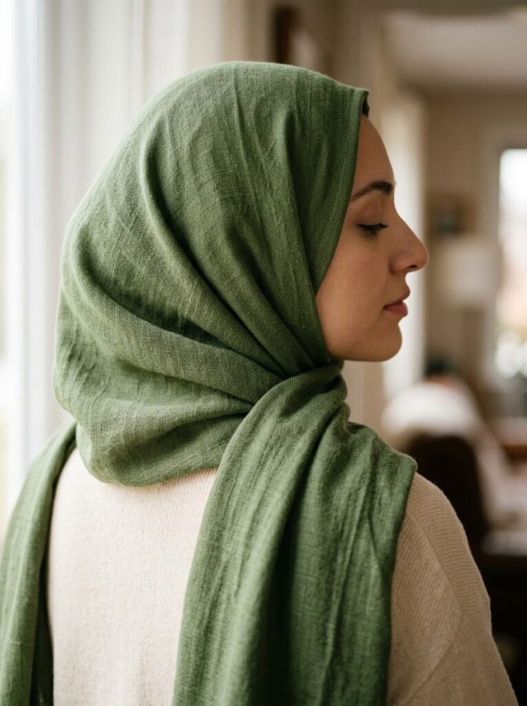
If you cover your hair, your scarf is not an accessory. It is the largest single colour block in the outfit and it sits directly against your face, which is the one position where a colour either flatters you or drains you and there is no third option.
This is where mainstream undertone advice half-works. The usual test — hold the fabric up in natural light, see whether your skin brightens or shadows appear underneath — is exactly right. What is missing is that for you it is not a test for a top. It is a test for the item closest to your face, and the stakes are higher than for anyone reading the same tip and applying it to a t-shirt.
Three practical rules for the scarf position:
1. The safest saturated shades near the face this season are the earth tones. Moss green, burnt olive and chocolate brown carry saturation without the drain, because their undertones sit close to skin rather than fighting it.
2. The riskiest are the acid brights. Chartreuse next to the face is a genuine gamble and it is the one shade I would keep off the scarf entirely unless the mirror test is emphatic. Put it lower down.
3. Cream is not the neutral it looks like. Warm ivory near the face is beautiful on warm and deep skin tones and can wash out very fair complexions completely. It is the shade most likely to be bought as a “safe” choice and worn twice.
Test in daylight, near a window, with no makeup. Trust what your face does over what the trend report says. This applies to every season and it applies double when the fabric is framing you.
The three-block formula
Most covered outfits resolve into three visible blocks. Scarf, outer or top layer, bottom half. Once you see the outfit that way, colour stops being guesswork.
One saturated. Two anchors. One block carries the trend shade. The other two sit in chocolate brown, cream, black or a deeper version of the same family. This is the formula that works nine times out of ten and it is the one to default to while you are learning what suits you.
Or: all three tonal. This is the covered wardrobe’s genuine advantage, and it is worth understanding why. Tonal dressing — three blocks in one colour family, varying in depth and texture — reads as expensive and deliberate. It also needs length to work; a tonal outfit on a short hem can look like separates that failed to match, while the same palette running unbroken from scarf to hem reads as one considered line. Oxblood over burgundy over deep plum. Chocolate over camel over cream. You have more vertical canvas than the outfit these trends were designed for, and tonal dressing is the one place where that is an outright advantage.
Never: three saturated blocks. Chartreuse scarf, cobalt coat, tomato skirt. Without skin to break them up, three loud blocks in direct contact do not read as bold colour blocking. They read as costume.
Shade by shade, with the dose
Oxblood and burgundy. The most generous colour of the season for a covered wardrobe. Deep enough to hold a large surface without shouting, and it works at every block. Full-length coat, maxi skirt, scarf — all fine. The tonal version is the strongest look in this entire article.
Chocolate brown. Treat this as your base, not your statement. It replaces black as the anchor and it flatters far more skin tones. Buy it in the biggest pieces you own — the coat, the abaya, the wide-leg trousers — and let everything else sit against it. Suede is the texture stylists have singled out this season, so a suede boot or bag in the same family compounds the effect.
Tomato and cherry red. Warmer and easier than a true blue-based red, but this is the shade where the surface-area rule matters most. A red maxi coat is a decision; a red scarf is a styling choice. Start at the scarf, move up only when you know how you feel in it.
Chartreuse. Smallest block only. A bag, a cuff, a shoe, a thin belt over a neutral layer. It exists to stop the season’s browns and blacks from going flat, and it does that job in a two-percent dose. Head-to-toe chartreuse in a covered silhouette is an enormous amount of acid green.
Moss green and burnt olive. The quiet winners. Saturated enough to feel current, earthy enough to behave like neutrals, and among the kindest shades near the face. If you buy one new scarf this autumn, this is the family to buy it in.
Muted clay and blush. Dusty, beige-leaning pinks that function almost as neutrals. Useful for softening an all-brown or all-black outfit without introducing a second loud colour. Works particularly well as the middle block.
Cobalt. A large-block colour that behaves better than its brightness suggests, because it sits comfortably against both warm and cool neutrals. A cobalt outer layer over cream or chocolate is a genuinely strong outfit.
Cream and texture-mixed black. The anchors. The specific note this season is that flat black reads dull — the runway version mixes surfaces, so wool against leather against a matte knit. For a covered wardrobe this is easy, because you are already layering three fabrics. Just make sure they are not all the same one.
What to buy first, if you are buying one thing
In order:
- A scarf in moss green or burnt olive. Highest impact per pound, lowest risk, and it updates every outfit you already own.
- A chocolate brown outer layer. It becomes the base the whole season builds on.
- One oxblood piece, sized large. Skirt, coat or abaya. This is the season’s colour and it is the one you will still be wearing in three years.
Skip, unless you already know it suits you: chartreuse in anything larger than a bag, and cream near the face.
What this season is not asking you to do
One last thing, because the volume of trend content in August makes everything feel urgent. Most of these colours are evolutions, not replacements. Burgundy has been building for several autumns. Chocolate brown has been the quiet story for two. Tomato red arrived last spring and simply refused to leave.
You do not need a new palette. You need one or two additions that sit correctly against what you already have — and the dosage right, which is the part the guides skip.
Key Takeaways
- Fall 2026’s palette runs oxblood, chocolate brown, tomato red, chartreuse, moss green, muted clay, cobalt, and cream with texture-mixed black.
- On a covered outfit the same colour covers two to three times the surface, so downgrade every trend recommendation by one garment size.
- The scarf is the largest block and the closest to your face — test it bare-faced in daylight and treat that result as final.
- Default formula: one saturated block, two anchors. The alternative is full tonal, which long silhouettes do better than short ones.
- Three saturated blocks touching with no skin between them reads as costume, not colour blocking.
- Best single purchase: a moss or burnt olive scarf. Highest-risk purchase: chartreuse in anything bigger than a bag.
FAQ
Q1. What are the fall 2026 color trends?
Oxblood and burgundy anchor the season, with chocolate brown widely treated as the new neutral. Tomato and cherry red carried over from spring, chartreuse is the loud accent, and moss green, muted clay, cobalt, warm cream and texture-mixed black complete the palette.
Q2. How do you wear bright fall colors modestly?
Move the colour down one garment size from what trend guides recommend. If a guide styles a shade as a coat, wear it as a skirt or scarf. Keep saturated colour to one of your three visible blocks and anchor the other two in brown, cream or black.
Q3. What are the best hijab colors for autumn 2026?
Moss green, burnt olive and chocolate brown are the most flattering saturated shades near the face this season, because their undertones sit close to skin. Test any scarf bare-faced in daylight before buying — the fabric closest to your face has the biggest effect on how you look